Choosing Color by Feeling, Not Just by Trend
Before I think about what color a room should be, I think about how I want it to feel.
Quiet. Warm. Moody. Airy. Intimate. Energizing.
That question usually tells me far more than a list of trending paint colors ever could.
Because color doesn't exist independently.
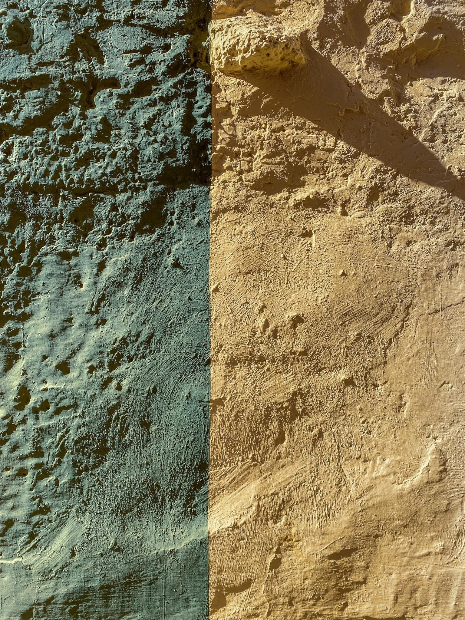
The same muted green can feel earthy in one room and cool in another. A cream can look beautifully warm at noon and completely different once the sun disappears. Floors, upholstery, wood tones, neighboring rooms and even the landscape outside the windows influence how we perceive it.
That's why I never think about paint as an isolated decision.
Start with the room itself.
Pay attention to when the room receives natural light and how that light changes throughout the day.
Then look at what isn't changing: flooring, stone, cabinetry, major furniture pieces, architectural details.
Those elements are already part of the palette.
The paint needs to have a relationship with them.
Look beyond white.
Neutral doesn't have to mean white, beige or gray.
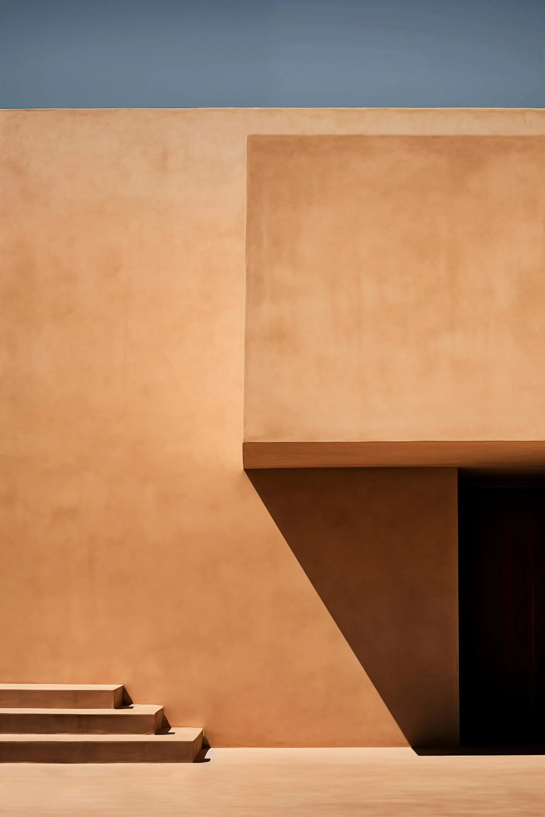
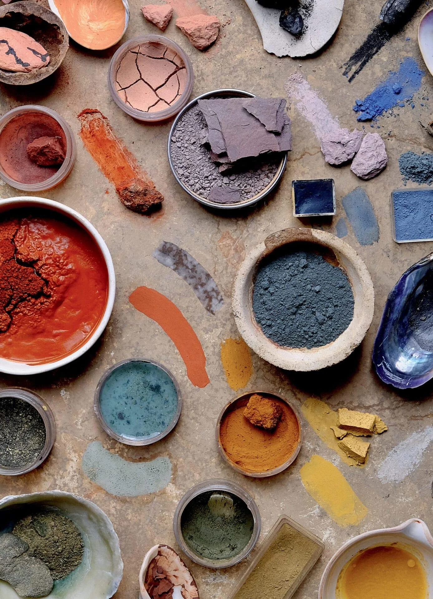
Dusty greens, muddy pinks, tobacco browns, softened ochres, mineral blues and deep earth tones can behave almost like neutrals when they're surrounded by the right materials.
Sometimes introducing color actually makes a space feel calmer because it gives everything else something to relate to.
Always sample it in the actual room.
A tiny paint chip under fluorescent store lighting tells you very little.
Put a generous sample on the wall and live with it.
Look at it in morning light. Afternoon light. At night with your lamps on.
Notice what happens next to your flooring and furniture.
Color is experiential.
And don't choose something simply because it's everywhere.
Trends can introduce us to colors we might not have considered, but they shouldn't determine what belongs in our homes.
I'm much more interested in choosing a color because it makes an old painting suddenly come alive, beautifully offsets the wood in a room, or creates exactly the atmosphere we wanted.
The best color isn't necessarily the most current one.
It's the one that makes everything around it make more sense.